
More AI content means more visual noise. Here's how smart design teams in Southeast Asia can cut through and build brand signal that actually converts.
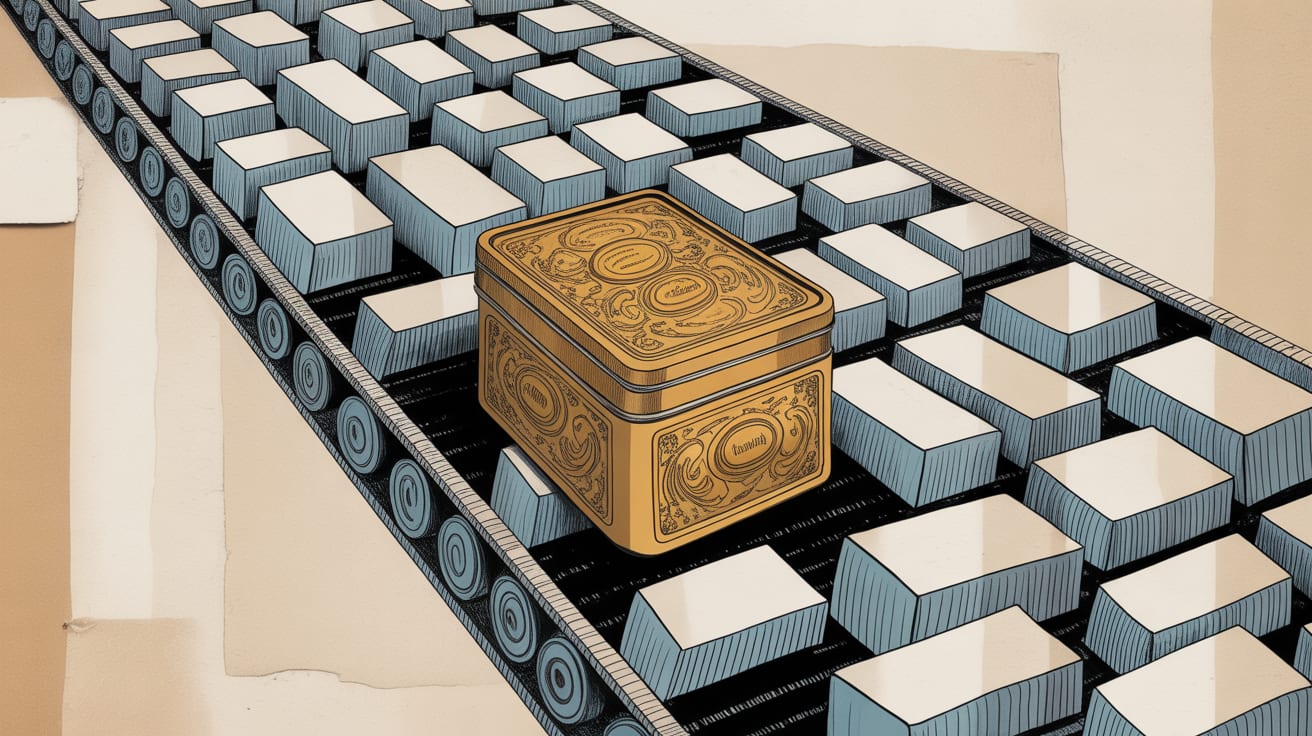
Sturgeon’s Law — the old sci-fi adage that 90% of everything is crud — was coined before generative AI could produce ten thousand landing pages before lunch. UX Collective’s Chris R Becker recently argued that AI doesn’t repeal Sturgeon’s Law; it industrialises it. The crud ratio stays roughly constant, but the absolute volume of crud expands at a rate no human editorial team can manually filter. For design and marketing teams, this isn’t a content problem — it’s a signal problem. And signal problems have design solutions.
The Perception Gap AI Can’t Close
Consider what photographer Adriana Mora and art director Celia Pladevall did with Commercial Candy — a project that took corner-shop sweets, the kind you’d find at any 7-Eleven on Sukhumvit Road, and reframed them as luxury objects through controlled lighting, deliberate composition, and material contrast. The candy didn’t change. The perceived value transformed completely. That’s not a trick. That’s the core mechanic of design: shaping what attention assigns worth to.
AI-generated imagery and templated UI can replicate surface aesthetics, but it struggles to replicate intentionality — the choices that signal a brand has thought carefully about what it’s communicating and to whom. Users, particularly in high-consideration purchase categories, are increasingly calibrated to detect the difference. Shopee’s own internal UX research (cited in their 2025 seller design guidelines) found that product listings with bespoke photography converted at 23% higher rates than those using standard catalogue shots, even when the underlying product was identical.
Volume Is a Design Systems Problem
Here’s where it gets commercially interesting. If AI is flooding every channel with adequate-but-undifferentiated content, the brands that win aren’t necessarily those producing less — they’re those with design systems robust enough to maintain quality signal at scale. A design system isn’t just a component library. It’s an editorial constitution: it defines what your brand refuses to do as much as what it does.
For marketing teams operating across Southeast Asia’s fragmented platform landscape — LINE OA in Thailand, Zalo in Vietnam, TikTok Shop across the region — this matters acutely. Each platform has its own UI conventions, safe zones, and content cadences. A weak design system means every localised execution drifts. A strong one means your Grab banner and your Lazada hero image and your TikTok creative all read as the same brand, even when produced by three different vendors in two different cities.
The practical step: audit your current asset library for variance, not just quality. High variance — inconsistent typography, shifting colour temperature, misaligned tone — is the visual equivalent of background noise. It’s not that any individual asset is bad; it’s that the aggregate reads as a brand that’s not sure what it is.
Craft as a Monetisation Signal
From a data and monetisation standpoint, design quality is increasingly legible in the numbers — if you know where to look. Publishers using premium editorial illustration and considered typography on native ad units consistently outperform those running AI-generated stock on CPM floors and click-through rates. The mechanism isn’t mysterious: design quality functions as a trust proxy. When an environment looks considered, users extend more credibility to the content within it.
This is the insight Commercial Candy makes viscerally: the same object, reframed with craft and intentionality, commands a different price point. For brands running performance campaigns on Meta or programmatic display, this translates directly. Creative quality scores — which Meta’s ad auction weights — correlate with how distinctive and deliberate an asset reads, not just whether it’s technically polished. Brands that invest in original photography and considered layout are buying themselves lower CPMs. That’s a design ROI conversation most CMOs aren’t having, but should be.
For teams operating with constrained budgets — which is most of Southeast Asia’s mid-market — this doesn’t mean abandoning efficiency. It means being strategic about where craft is deployed. A hero image that anchors a campaign deserves original photography and art direction. The supporting carousel tiles can be systemised. The ratio matters; the principle is that craft should be concentrated where perception is formed.
The Anti-Noise Design Checklist
Becker’s argument about AI and Sturgeon’s Law implies a practical mandate: design teams need to function as active quality filters, not just production pipelines. Three implementation moves that don’t require a large budget:
Establish creative constraints before briefing AI tools. Specific aspect ratios, defined colour temperatures, and mandatory negative space rules force outputs toward your brand’s visual register rather than the mean of everything the model was trained on. Constraints are the creative director AI cannot replace.
Instrument your creative decisions. If you’re running A/B tests, tag variants by design choice — not just copy or CTA. This builds a proprietary dataset linking specific visual decisions to conversion outcomes. Over 6–12 months, that dataset becomes a strategic asset: you’ll know empirically whether your audience in Jakarta responds differently to warm vs. cool colour temperatures, or whether mobile users in Manila engage longer with illustrated vs. photographic hero images.
Treat mobile-first as a design constraint, not an afterthought. In Southeast Asia, over 75% of digital consumption happens on mobile screens under 6 inches. Design systems built desktop-first and adapted downward consistently produce cluttered mobile experiences. The reverse — designing for the smallest, lowest-bandwidth context first — forces the kind of editorial restraint that naturally increases signal clarity across all formats.
The broader provocation here is worth sitting with: if AI compresses the cost of producing adequate design to near-zero, what happens to the market value of exceptional design? History suggests scarcity of craft in a commoditised category doesn’t erode its premium — it amplifies it. The question for brand and marketing leaders is whether they’re building the systems and the taste to occupy that premium position, or whether they’re optimising for volume in a race to the bottom of Sturgeon’s curve.
At grzzly, we work with marketing and digital teams across Southeast Asia to build design systems and creative frameworks that hold signal at scale — whether that’s across five Shopee storefronts or a 12-market campaign. We also help brands instrument their creative decisions so design choices become commercially legible data, not just aesthetic calls. If your visual identity is starting to look like everyone else’s, that’s usually a systems problem before it’s a talent problem. Let’s talk
Sources

Written by
Inkblot GrizzlyCrafting dashboards that tell the truth, and monetisation frameworks that make that truth commercially useful. Turns abstract data assets into revenue-generating products for publishers and brands alike.