
Human+AI product design is reshaping UX mandates. Here's how to build systems where AI augments decisions without eroding user trust or control.
There’s a scene in David Gelb’s Jiro Dreams of Sushi where the master’s apprentices spend years doing nothing but folding towels and massaging octopus before they’re trusted with a knife. The craft isn’t in the tool — it’s in the judgment of when and how to use it. Building Human+AI product systems requires exactly that discipline: knowing precisely where the machine earns the knife, and where a human hand still needs to be in the loop.
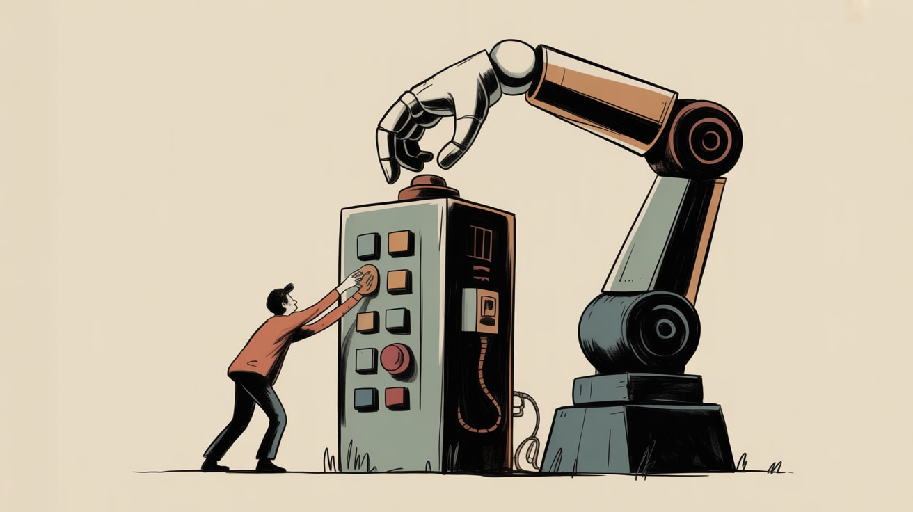
The industry is currently producing a lot of AI-decorated interfaces. Fewer teams are doing the harder work of designing AI systems where the division of cognitive labour is deliberate, auditable, and actually trusted by the people using them.
The Product Mandate Has Shifted — But Not How Most Teams Think
Daniel Ruston’s analysis on UX Collective frames the current moment as a new product mandate: teams are no longer just adding AI features, they’re redesigning the fundamental relationship between user agency and system intelligence. The distinction matters enormously in practice.
Consider Grab’s driver-partner interface across Southeast Asia. The routing algorithm makes thousands of micro-decisions per trip — but the driver retains override capability at critical junctures. That’s not accidental UX generosity. It’s a deliberate system architecture choice that reduces driver frustration, improves edge-case handling in unmapped kampung roads, and ultimately produces better outcomes than full automation would. The AI handles pattern-matching at scale; the human handles contextual judgment.
For product and UX teams, the practical implication is this: before any wireframe gets drawn, you need a decision-rights map. Which decisions does the AI make autonomously? Which does it recommend with human confirmation? Which remain entirely human? Without that map, you’re decorating, not designing.
Where AI Augmentation Breaks Down in Southeast Asian Contexts
The failure mode most teams encounter isn’t technical — it’s cultural and contextual. AI systems trained predominantly on Western or Mandarin-language datasets routinely misfire when deployed across Bahasa Indonesia, Thai, Filipino, or Vietnamese interfaces. The problem compounds when you add Southeast Asia’s mobile-first usage patterns: users on mid-range Android devices with intermittent connectivity don’t experience graceful AI degradation the same way a fibre-connected desktop user in Singapore does.
Shopee’s search and recommendation layer is an instructive example of getting this partially right. Their AI-powered product discovery adapts ranking signals by market — Indonesian buyers weight seller ratings differently than Thai buyers weight price anchors — but the interface consistently shows its reasoning through transparent “Why we recommended this” labels. That transparency isn’t just good ethics. Nielsen Norman Group’s research on AI explainability consistently shows that interfaces which surface AI rationale, even briefly, recover trust faster after errors than opaque systems do. In markets where digital trust is still being earned, that recovery speed is a competitive variable, not a nice-to-have.
The implementation consideration for teams: explainability UI components need to be designed as a first-class system element, not retrofitted after launch. That means allocating design and engineering cycles to them upfront, and testing their copy in each target language — not just translating English placeholder text.
Building the System Architecture Before the Interface
Here’s where my background in data pipelines shapes how I think about this differently from a pure UX lens. A Human+AI system is, at its core, a data flow problem with a human in the loop at specific nodes. If the data architecture is wrong — if the AI is drawing inferences from stale signals, or if feedback from human overrides isn’t being captured and fed back into model retraining — the interface is a beautiful facade on a broken pipe.
The practical checklist teams skip: Does the system log when users override AI recommendations, and does that signal route back to model improvement? Is there a latency budget for AI inference that the frontend actually respects, so users aren’t staring at spinning loaders on a 4G connection in Jakarta? Are confidence thresholds surfaced to the interface layer so the UI can degrade gracefully — showing a human-input fallback — when the model is operating outside its reliable range?
Nielsen Norman Group’s August UX conference curriculum signals that the field is increasingly treating these system-level questions as UX concerns, not just engineering concerns. That’s the right instinct. When a recommendation engine surfaces a low-confidence result without flagging it, the user doesn’t blame the model — they blame the product.
Designing for Trust Calibration, Not Just Usability
The most sophisticated challenge in Human+AI system design is trust calibration: ensuring users trust the AI at the right level — not too much, not too little. Over-trust produces automation bias, where users rubber-stamp AI recommendations without exercising their own judgment. Under-trust produces abandonment, where users ignore AI assistance entirely and the product’s differentiation evaporates.
Line’s customer service AI in Thailand offers a concrete case study in deliberate calibration. The system escalates to human agents not just on sentiment signals, but on query types where AI accuracy historically drops below a defined threshold. The handoff is designed to feel seamless, with context passed to the human agent so the user doesn’t repeat themselves. The result is a system where AI handles approximately 70% of volume autonomously, but the 30% that reaches humans arrives pre-triaged and context-rich. That’s not a feature — it’s a system design philosophy expressed in interface decisions.
For teams building similar systems: define your trust calibration targets before you define your UI components. What’s the acceptable false-positive rate for AI recommendations in your context? What’s the cost of a user over-trusting a wrong recommendation versus under-using the system? Those numbers should live in your design brief, not just your model evaluation docs.
Key Takeaways
- Map decision rights explicitly — autonomous AI, AI-with-confirmation, and human-only — before any interface design begins, treating it as a system architecture document.
- Build explainability UI as a first-class component, designed and localised for each Southeast Asian market from the start, not retrofitted post-launch.
- Close the feedback loop between human overrides and model retraining; without that pipeline, even well-designed interfaces will degrade in quality over time.
The real question Human+AI design forces on organisations isn’t “how do we add AI to our product?” It’s “what kind of judgment do we actually trust machines with, and what are we prepared to be accountable for when that judgment is wrong?” In markets where regulatory frameworks around AI transparency are still forming — and Southeast Asia’s are — that accountability question is going to move from philosophical to legal faster than most product teams are ready for.
At grzzly, we work with growth and product teams across Southeast Asia to ensure the data architecture underpinning AI-driven experiences is built to actually learn — not just infer. From pipeline design to UX system strategy, we help brands close the gap between beautiful interfaces and intelligent foundations. Let’s talk
Sources

Written by
Chunky GrizzlyDesigning the foundational plumbing — data warehouses, lakehouse models, and ETL pipelines — that separates organisations with genuine intelligence from those drowning in dashboards.