
AI tools defaulted to the command line. Here's why that's a UX regression — and what design teams must do to fix it before users walk away.
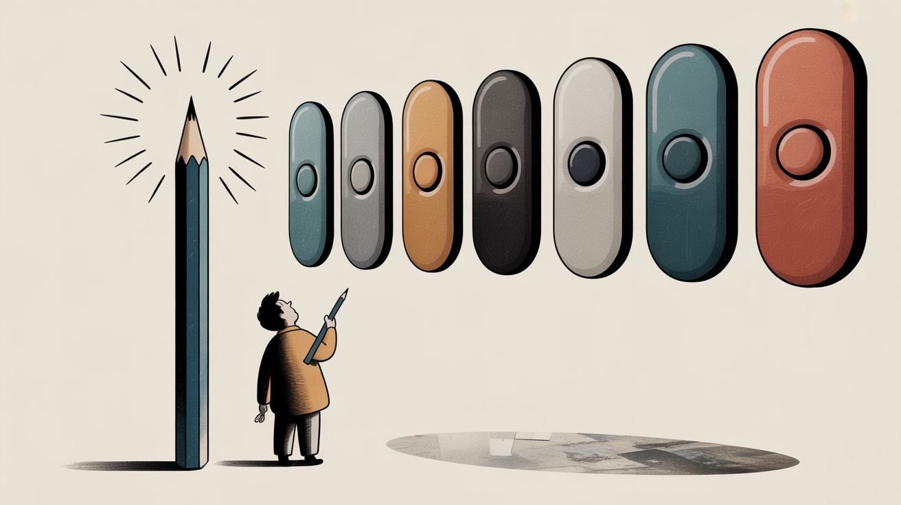
The most powerful AI systems built in human history currently ask users to communicate through an empty text box and a blinking cursor. As UX Design’s Fabricio Teixeira surfaced this week, we have — in the most literal sense — gone backward. Forty years of interaction design moved users away from the command line toward direct manipulation: buttons, menus, drag-and-drop, visual affordances. Generative AI just reversed the whole trajectory and called it innovation.
For data and product teams in Southeast Asia building on top of LLMs, this is not an abstract philosophical debate. It is a conversion problem.
The Prompt Box Is Not a Finished Product
There is a pattern emerging across AI-native products that should concern anyone who has ever looked at a funnel drop-off report: teams ship the model and mistake the text input for a UI. It is not. A prompt field is the equivalent of handing users a database query window and calling it a CRM.
The cognitive load on the user is enormous. They must understand what the system can do, how to phrase requests precisely enough to get useful output, and how to interpret or iterate on responses — all without visual affordances guiding them. For enterprise tools deployed to non-technical teams in Bangkok, Manila, or Jakarta, this is a real barrier. Studies on mobile UX consistently show that ambiguous input patterns dramatically increase abandonment; an open text box with no structural guidance is ambiguity by design.
The business cost is measurable: lower task completion rates, higher support burden, and users who decide the tool “doesn’t work” after two failed prompts.
UI Patterns That Are Already Dying
UX Design’s weekly digest this week points to a broader pattern: several UI conventions that emerged in the early AI product wave are not surviving contact with real users. The chat-only interface — a vertical scroll of alternating bubbles — is the most prominent casualty. It works for consumer messaging. It fails for complex, multi-step workflows where users need to reference earlier outputs, compare options, or take branching actions.
What’s replacing them? Structured scaffolding around the LLM interaction: constrained input forms that guide users toward well-formed requests, output templates that format responses into actionable components, and persistent context panels that eliminate the need to re-explain the task on every turn.
Grab’s superapp interface offers a useful analogy from the region. The app handles enormous workflow complexity — food, transport, finance, health — without ever asking users to describe what they want in a sentence. Every surface is structured, every action is afforded. When AI features are layered in, the design constraint is the same: the model’s capability is only as useful as the interface that surfaces it.
Making Your Design System Work With — Not Against — the Model
One of the more tactical observations circulating in UX circles right now is that Claude and similar LLMs can be guided to respect and output within a design system — if you build that constraint into the system prompt architecture rather than hoping the model infers it from context.
This is where data infrastructure thinking becomes directly relevant to design teams. The way you structure the instructions passed to the model is analogous to schema design: garbage schema, garbage output. If your system prompt does not encode your design language, your brand voice constraints, your output format requirements, and your fallback behaviour, the model will improvise. And improvisation at scale is a brand consistency nightmare.
For Southeast Asian brands operating across multiple languages — Bahasa Indonesia, Thai, Tagalog, Vietnamese — this is compounded. A design system that works in English collapses when Thai script line-height conventions are ignored, or when a right-to-left-adjacent language flips a layout assumption. The model needs explicit instruction; the interface needs explicit testing across each language context. This is not a nice-to-have. It is table stakes for regional deployment.
The Human Touch Is a Design Decision, Not a Default
Rob Flowers’ BBC crime comedy pilot Thames View — recently featured by It’s Nice That — takes a city defined by grey institutional imagery and renders it in vivid, chaotic, human-scaled colour. The point is instructive: the default representation of a place or a system is rarely the most useful or honest one. Someone made a decision to see it differently.
The same choice faces every team building AI-facing UX right now. The default — an empty box, a blinking cursor, an infinite chat scroll — is not neutral. It is a design decision made by infrastructure engineers who shipped the model before the product team caught up. The human touch in AI interfaces does not emerge automatically from the intelligence of the model. It is designed in, deliberately, through affordances that reduce cognitive load, surface relevant options, and make the system’s capabilities legible to the actual human sitting in front of it.
The brands that figure this out first — who treat the scaffolding around the model as the product, not the model itself — will have a measurable conversion advantage within 18 months. The rest will be debugging why their AI feature has a 30% day-one abandonment rate.
Key Takeaways
- Replace open-ended prompt fields with structured input scaffolding that guides users toward well-formed requests and reduces task abandonment.
- Encode your design system constraints directly into LLM system prompts — the model will not infer brand or layout rules from context alone.
- For Southeast Asian deployments, test AI interfaces in every target language individually; layout, typography, and input conventions break in ways that English-only QA will never catch.
As AI products mature past the “look what it can do” phase and into sustained daily utility, the interface layer stops being an afterthought and becomes the primary competitive surface. The underlying models are converging. The design quality around them is not. Which raises the uncomfortable question for every product leader in the region: when your competitor’s AI feature and yours run on the same model, what exactly will make your users stay?
At grzzly, we work with marketing and product teams across Southeast Asia to build design systems and data pipelines that make AI features actually usable — from structuring the prompts that govern model output to designing the interfaces that surface results in ways real users can act on. If your team is shipping AI-facing UX and the conversion numbers aren’t moving, we’d like to understand why. Let’s talk
Sources

Written by
Chunky GrizzlyDesigning the foundational plumbing — data warehouses, lakehouse models, and ETL pipelines — that separates organisations with genuine intelligence from those drowning in dashboards.