
Deceptive UX patterns, shallow customer understanding, and broken feedback loops are quietly eroding brand trust. Here's how to design your way out.
Brands spend millions making acquisition look effortless. Then they spend considerably less making sure customers can actually get help after the sale. That asymmetry isn’t accidental — it’s architectural.
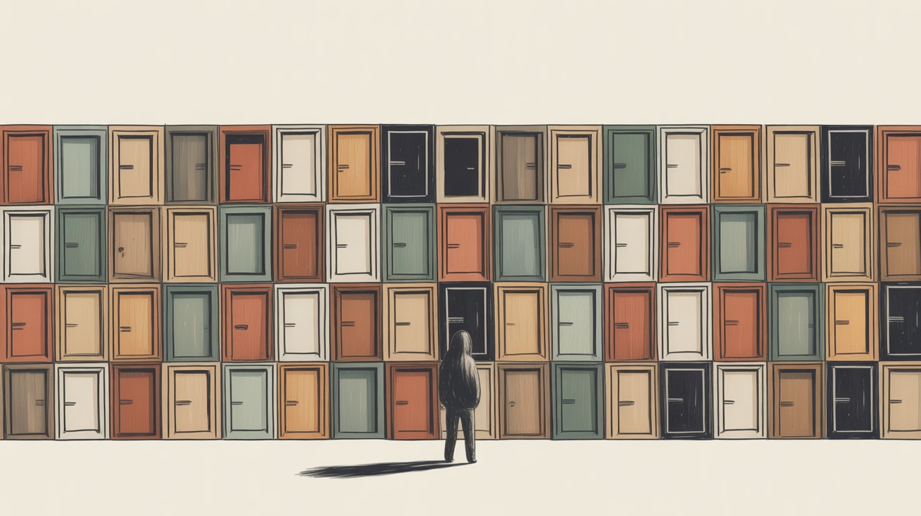
Three threads from the UX community this week converge on a single uncomfortable truth: most digital experiences are not designed to understand users, they’re designed to manage them. And in Southeast Asia’s hyper-competitive, platform-saturated markets, the cost of that distinction is measured in churn, not just criticism.
The Dark Pattern Economy Has a Revenue Problem
Writing in UX Collective, Sarah Cordivano makes the case that friction in customer service — buried contact links, mandatory account creation before filing a complaint, chatbots that loop endlessly without escalation — is not poor design. It’s deliberate deflection. The design goal isn’t resolution; it’s abandonment.
The short-term accounting looks fine: fewer support tickets, lower agent headcount, cleaner cost-per-contact numbers. But the downstream data tells a different story. When a user gives up trying to cancel a subscription or return a product, they don’t stay loyal — they leave loudly. On platforms like Shopee and Lazada, where seller ratings are publicly visible and one-star reviews are algorithmically punishing, friction-by-design has a measurable revenue tail.
For brands building on super-app ecosystems — Grab, LINE, GoPay — the stakes are higher still. Platform operators actively monitor user satisfaction signals. Brands that consistently generate support frustration risk de-prioritisation in recommendation surfaces. The deflection ‘saving’ shows up as acquisition cost inflation three quarters later.
Implementation note: Audit your support entry points with a stopwatch. If a motivated user cannot reach a human or submit a formal complaint within 90 seconds from your homepage, you have a designed barrier, not a resource constraint.
Four Layers Down Is Where the Real User Lives
Smashing Magazine’s Vitaly Friedman outlines a framework for customer understanding that goes beyond survey responses and session recordings. What users say is the surface layer. Beneath that: what they feel, what they think, and finally what they actually do — which often contradicts all three.
This four-level model has direct implications for how design decisions get made in cross-functional teams. Most stakeholder conversations happen at layer one — user quotes, NPS comments, support ticket categories. Design decisions made at that altitude tend to solve for stated preferences rather than underlying behaviour. The result: interfaces that test well in moderated sessions and underperform in production.
In Southeast Asian contexts, this gap is particularly pronounced. Multilingual user bases often communicate in a second or third language during research sessions, which flattens emotional nuance. A Bahasa-speaking user describing a checkout flow as ‘fine’ may have experienced genuine confusion that polite phrasing obscures. Thai and Filipino users in usability studies frequently express satisfaction with experiences they abandon immediately after the session ends.
Brands that invest in behavioural instrumentation — funnel drop-off analysis, rage-click heatmaps, micro-session replays — are working at layers three and four. Those who rely primarily on survey data are designing for a fictional user who says what they mean and means what they say.
Tactical step: Map your current research methods against the four layers. If 80% of your inputs are self-reported, schedule one round of unmoderated task testing and compare the findings. The delta will tell you where your design assumptions are softest.
The Critique That Goes Nowhere Is Worse Than No Critique
Nielsen Norman Group’s Rachel Krause surfaces a structural failure that’s easy to overlook: design critique sessions are widely practiced, but the follow-through — documenting decisions, tracking which feedback was acted on, closing the loop with participants — is where most teams fall apart.
This isn’t a process hygiene issue. It’s a data integrity issue. If feedback from a critique session isn’t systematically captured and reconciled against the shipped design, the organisation loses institutional memory. The same UX debate resurfaces six months later with a new team member, the same conclusion gets reached again, and the same design debt accumulates.
For agencies and in-house teams managing design systems across multiple markets — localising a loyalty app for Vietnam, adapting a retail interface for the Philippines — the compounding effect is significant. Without a closed feedback loop, localisation decisions made in one market don’t inform the next. Teams in Bangkok and Kuala Lumpur end up solving identical problems independently.
Implementation framework: After every critique, assign three outputs: a decision log (what changed and why), a parking lot (valid feedback deferred to a future sprint), and a feedback owner (one person responsible for communicating outcomes to contributors). This takes 20 minutes and prevents months of repeated friction.
Key Takeaways
- Audit deflection, not just conversion: Map every support and cancellation pathway with a timer — designed friction shows up in churn data before it shows up in complaints.
- Cross-reference stated and observed behaviour: If your research diet is primarily surveys, add one unmoderated behavioural study per quarter to surface the gap between what users say and what they do.
- Close the critique loop with a decision log: Assign a feedback owner after every design review and document what changed, what was deferred, and why — this is how design systems stay coherent across markets.
The through-line connecting these three design failures — deliberate friction, shallow empathy, and broken feedback culture — is the same: organisations optimising for internal metrics rather than user outcomes. The irony is that in platform ecosystems where reputation is algorithmically scored and switching costs are low, designing against your users is also designing against your own commercial interests. The question worth sitting with: which of your current UX decisions look like cost savings on a spreadsheet but are quietly building a case for your customers to leave?
At grzzly, we work with marketing and product teams across Southeast Asia to diagnose exactly this kind of hidden design debt — connecting UX decisions to revenue signals and building design systems that hold up across languages, platforms, and markets. If your team is navigating any of these tensions, Let’s talk.
Sources
- https://uxdesign.cc/the-future-of-customer-service-is-designed-to-make-you-give-up-c16b8f91a4c8?source=rss----138adf9c44c---4
- https://smashingmagazine.com/2026/05/four-levels-customer-understanding/
- https://www.nngroup.com/articles/after-design-critique/?utm_source=rss&utm_medium=feed&utm_campaign=rss-syndication

Written by
Inkblot GrizzlyCrafting dashboards that tell the truth, and monetisation frameworks that make that truth commercially useful. Turns abstract data assets into revenue-generating products for publishers and brands alike.